Showing posts with label google. Show all posts

08 October, 2015

Accelerated Mobile Pages

Browsing the web from our phones is nowadays a common thing.  In fact it is now likelier to browse from your phone than from a desktop computer.  Personally, I find myself using a desktop browser only while I'm at work or while doing some desktopy thing (such as coding or messing with VMs and networks).  If I'm just browsing during the evening, for instance, its 99% from my phone.

My preferred way of browsing is via the forum kind of applications, such as reddit or hacker news, so at that point I'm not really using a browser.  However, the majority of the content is delivered from websites so you see and interesting title, tap on it, and the in-app browser or the main browser is opened.  This typically works fine, until the site you're accessing is a megalith and takes tens of seconds to load.  After at most 3 seconds, if barely any content has loaded, the link is forgotten and I move on the the next link.  That's it.

The problem is that these websites are offering too many features for them to be practical on a smartphone.  Sometimes websites take even longer because they need to load the comments section, then come the suggested posts, with ultra big resolution images, followed by the author's biography...  It's unnecessary, I just want to see content.

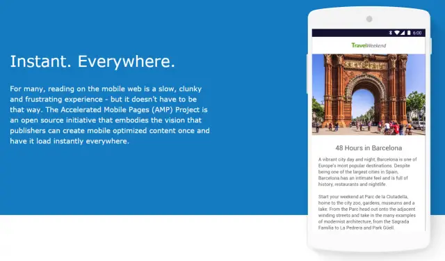
A team of internet companies, including Google, have come up with Accelerated Mobile Pages (AMP).  It is primarily a technological development (not exactly unheard of, as we'll see), but  through its restrictions it tries to limit the amount of unnecessary crap on pages.  As I said, it's a development, however much of this development is in terms of standards and rules rather than faster networks, or something like that.

In fact ,the focus is on basically banning a whole bunch of heavy and also some outdated HTML elements.  Unsurprisingly, no more <applet>, no more <frame> and no more <embed>.  There are also strict limitations on JavaScript, however the most surprising (but great) banned elements are <input> and <form> (with the exception of <button>).  It may not directly impact immediate performance of HTML, but it will surely stop developers from adding useless "post a comment" forms.

The focus is primarily on immediate content.  If I get a link while chatting and I open it up, I don't have more than 3 seconds to read the title and move back to the chat.  Thankfully, on Android, this experience shall now improve with the new chrome tabs introduced in Marshmallow.  It's a technical thing, but basically it avoids having to use either an in-app browser (which is isolated from your standard chrome) or opening up chrome (which is slow).

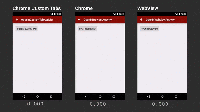
Chrome tabs are much faster, at least in this demo (via Ars Technica)

But let's get back to AMP.  As I said, it is content that the majority wants, so in this age of platform webapps, single-page sites and all the rest, simplicity, again, trumps features.  Despite the lack of features, static areas of a website are hugely important.  If you're interested, here's a short how-to, however it is fair to note that static this time is mostly client side, so no JavaScript - which means you'll probably need server-side processing if you have "dynamic" content.

AMP avoids the common JavaScript the web is used to and realises the idea of Web Components.  These do have JavaScript under the hood, but since they are managed differently, it makes the page load faster without synchronous blocks by JavaScript.  AMP also restricts inline styling, conditional comments and some CSS attributes (although CSS is not so limited compared to JS).

As yet, (being days or hours since being announced) I personally do not consider this as a major breakthrough technologically - it's only a set of rules to reduce the bloat on webpages who primarily host content.  However, I am very glad with the way things are going and I do hope it gains traction.  

The benefits I see are greatly improved user experience with much faster load times and no nonsense web pages along with better development.  The more modular the pages, due to web components, the easier it is to develop.  There are no messy inline styles or randomly placed JavaScript.  Things are put in their place and the rules are strict - otherwise you'll not qualify for AMP and your page won't make it to the top of search results.  

Unfortunately, I don't have that much control on this blog, otherwise I would have AMP'd it right away!

For further details, there are quite some resources:

06 October, 2015

Some points on the Android UI

Android is a great OS - there's no doubt about that, even if you measure that statement using the number of active installations.  It has an interesting history, starting from plans to create an OS for digital cameras and ending up being Google's core mobile platform running on around a billion devices.  It is technically well designed, open source and very adaptable; from CPU architectures to screen sizes, Android can adapt.

Progress of Android over the years (Ars Technica)


As Android progressed to meet the expected standards of the day, the general UI got more minimalist while more colours were introduced (older versions looked darker).  Despite the move towards a more modern UI in general, it is still possible for application developers to apply their own style.  A typical result of this support was that developers of older applications did not bother updating their styles to the latest version (this is basically an XML file).

What we ended up with is a FIAT 127 in 2015's motorshow.
Not quite in the same league
The problem with this situation is that not only we have to sometimes use outdated applications, but Google is also pushing a new 'UI language'.  There is nothing wrong in having a new UI language...except when few developers are following it, and you're not one of them.  If Android is to have a uniform, clean and modern UI, there should be a mechanism which automates the transition of styles to the latest standard in cases where the default file was left lying around.  Automation is not uncommon on the Android ecosystem - Code is checked for potential errors, style files must be up to standard, even copyright issues are flagged by a bot - so why not a simple style file?
What's the deal with this UI (SIM Tool Kit)?


As I mentioned earlier, there is also another problem which Google does not seem to want to fix - Material Design.  Consistency is key in product branding and Google is/was known for their efforts in this regard.  The ubiquitous bar in all their web products and their logo in the exact same location made it clear that this is a Google product.


Nowadays, their Android apps are cacophony of UI element styles and whatnot.  Despite their efforts to make Material Design the next standard, it's already been 2 years and I have no idea when this next will be now.  It can be seen in some apps, such as the settings, and the major Google apps.  However, applications such as the Google Analytics still sport the Android 4.3 UI.  Even worse is the app for Blogger - with UI probably designed by the Romans.

Yet again, even though the apps follow the general material design, all of them seem to have a language of their own.  One aspect which was recently highlighted was the lack of consistent scrollbars.  Now we got a new scrollbar in the application launcher too, for diversity.

Google Calender app has to be one of my favourites.  It's fast, visually appealing and above all, useful.  I use it regularly to set appointments, reminders, etc. just like all other users.  The problem with the whole Calendar ecosystem is the web version.  Why has Google introduced the Material Design, implemented it correctly in Calender on Android yet left the web version in the dark while at the same time it developed the Inbox service with correct material guidelines on both Android and the web (I'm not discussing whether Inbox is practical or not)?  I understand the drive towards mobile and I truly appreciate the improved UI on mobile, but I'm not in favour of sheer inconsistency (and then again, there are web versions better than their apps).

Yes this was quite a rant - not really helpful for many.  But it gets frustrating when you're working on your services and try to follow as many guidelines as possible to make your users happy.  Thankfully apps are not accepted or rejected based on their looks and interaction, although sometimes I do favour such a system as it does improve the users' mobile experience.

06 December, 2011

Google Graphs

I remember when I was studying maths and had to draw graphs, the task was not really difficult, but admittedly, I never really managed to draw perfect graphs.  But anyway, if I ever had some problems or if I just wanted to ensure that it was correct, I would go to Wolfram Alpha, put in my equation, and get an artistic graph, complete with differently coloured lines, zooming in and out, and fancy features which would eventually end up taking 10 minutes just because I liked watching my graph getting twisted by entering in random numbers and symbols.

Now though, with Google basically having it's own version of everything, from operating systems to social networks, there is new option.  One can now just type in an equation a nice graph is rendered along with other search results :D  I don't really need it but I think it is quite helpful for getting and idea of how a graph looks like.

It's got great features too; multiple graphs (separated by commas) each having a different colour, the solution, zooming, dragging and well some other details which I think I should leave up to you to find out :D